Bakkt
UI/UX design
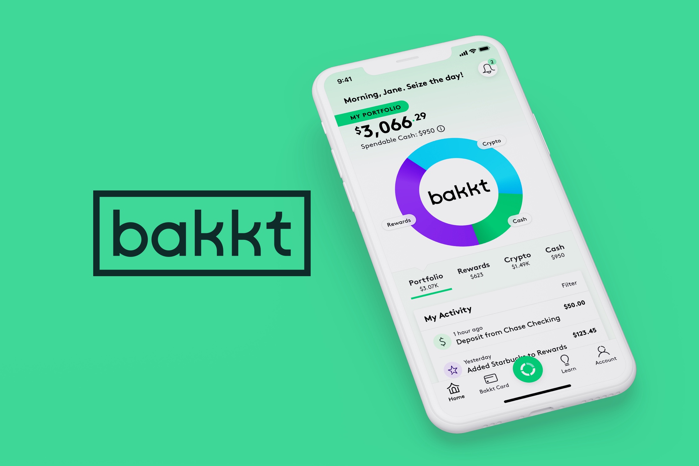
Bakkt helps users discover money they never knew they had by converting digital assets (e.g., reward points, airline miles, cryptocurrency) into spendable cash. Well known in the crypto space, Bakkt was expanding its offerings and becoming more consumer-friendly. Working with our brand team, who spearheaded a logo redesign and new identity, we crafted a digital design system for Bakkt's app and web experience.

Bakkt asked for help in two areas of the app: (1) adding rewards to an account and (2) the home screen. The client’s envisioned product was rather complex, requiring us to continually check in to make sure we were heading in the right direction before the design.


While tasked with the home screen section, we made sure to think through possible screen states and related functionality and provided those wireframes as well.

Old logo: Too serious and institutional. While unique, it stood out among competitors in a bad way.

New logo: Approachable and modern. Rounded forms (derived from circles) were a strong anchor point for the design system. Logo by Brian Gartside

Color was a big part of the overall brand system. Rewards, cryptocurrency, and cash are represented by purple, blue, and green, respectively. Our team used ColorBox to create an extended palette that could support the needs of the app and website beyond the initial brand team colors.


Brown by Lineto is the brand typeface, echoing the new logo’s circular forms, squared terminals, and monoline construction.


We designed Bakkt’s website where visitors can learn about the app and download. The new identity (logo, color, typography) were applied as well as elements from the app design work.
