Hanes
Model Citizens
UI/UX design
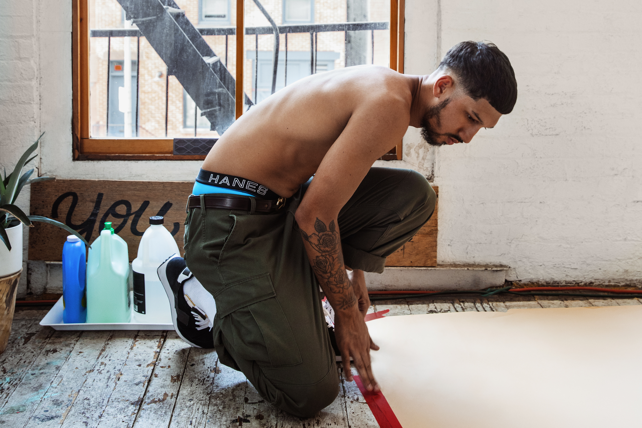
Hanes is known to most men for its everyday basics: T-shirts, socks, and, of course, underwear. While recognized for its comfort, Hanes wanted to change how men perceived the brand. The Model Citizens campaign featured everyday guys—not models—to show that Hanes makes men look and feel good, so they can do good.
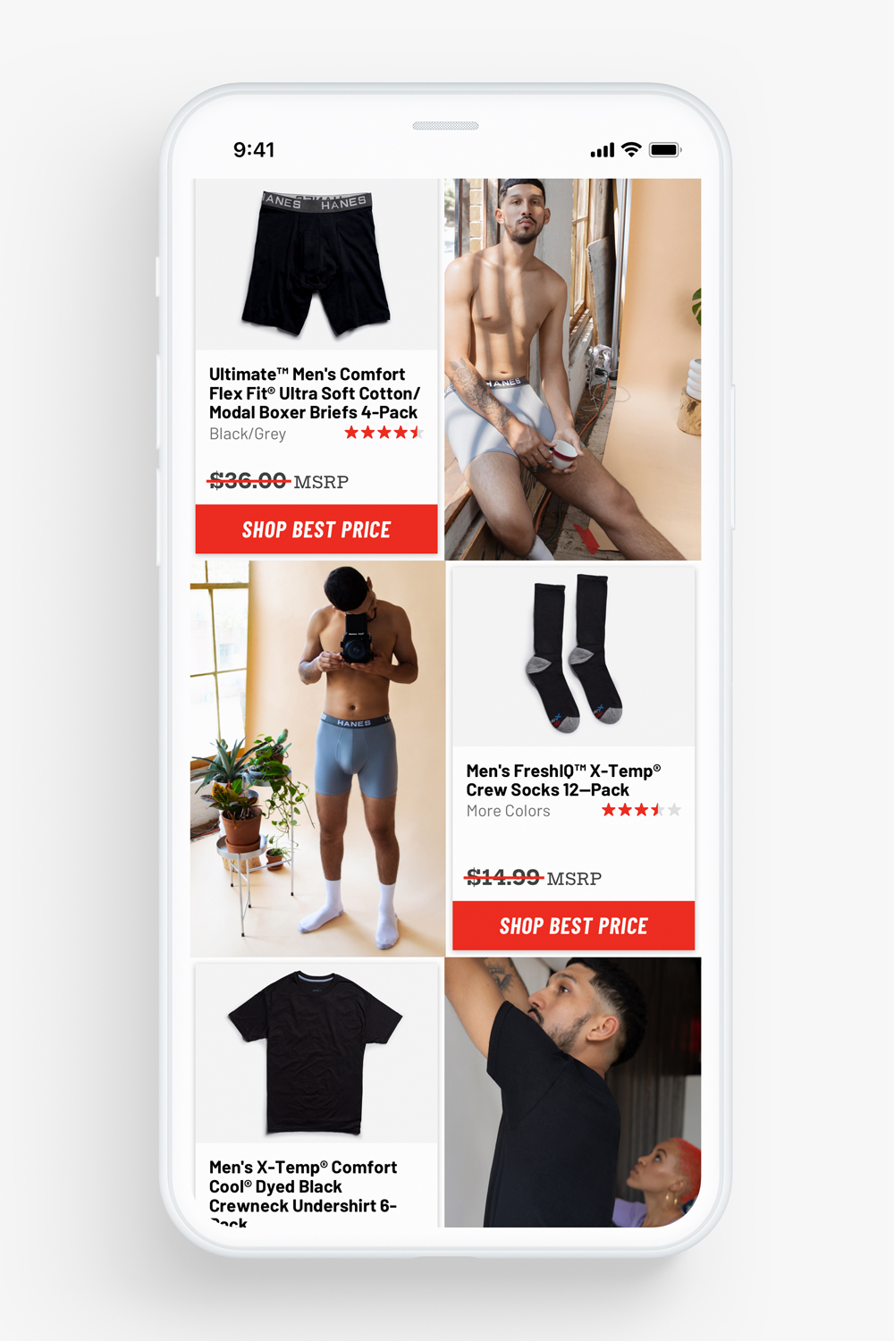
For the campaign landing page, we created an experience that highlighted both the model citizens’ stories and the Hanes products they wore. A modern layout showcased the campaign’s photography and allowed users to shop the looks on the Hanes.com.
For the experience font stack, we found a bold, handsome combination that spoke to Hanes as a classic brand for a modern guy.
For ease and cost, we used typefaces available for free on Google Fonts: Barlow, Barlow Condensed, and Hepta Slab.


Knowing there would be paid media driving to the experience, we made sure it responded well to different screens, especially mobile.
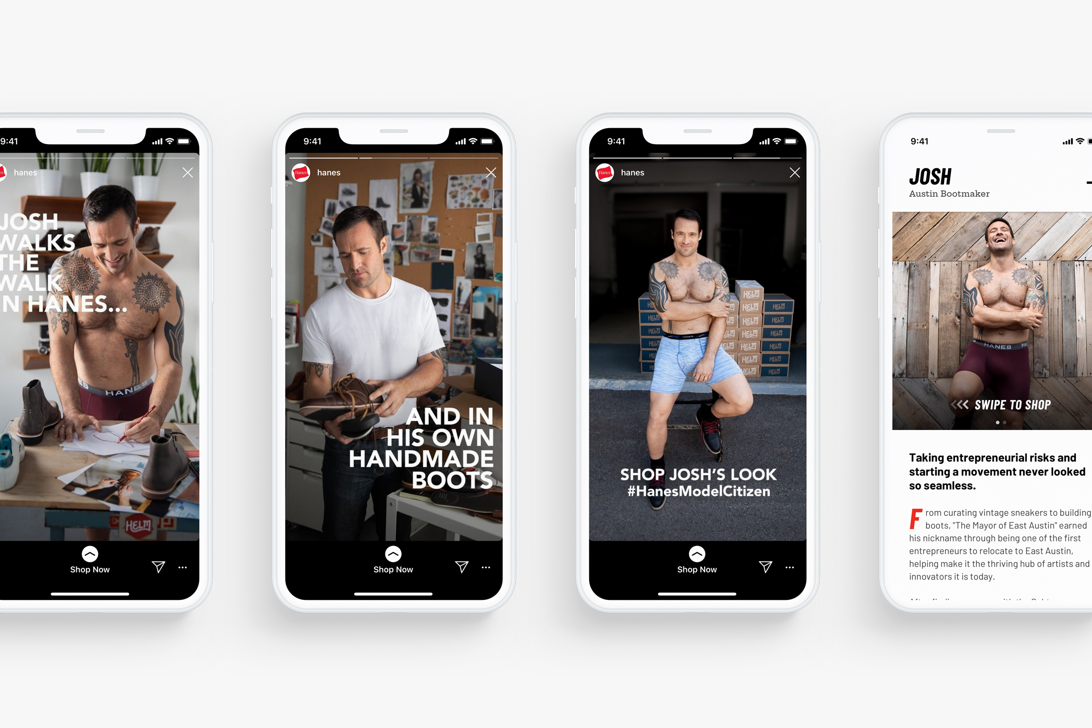
Sponsored Instagram stories allowed users to shop a model citizen’s look. Swiping up opened the experience directly to the featured model citizen.

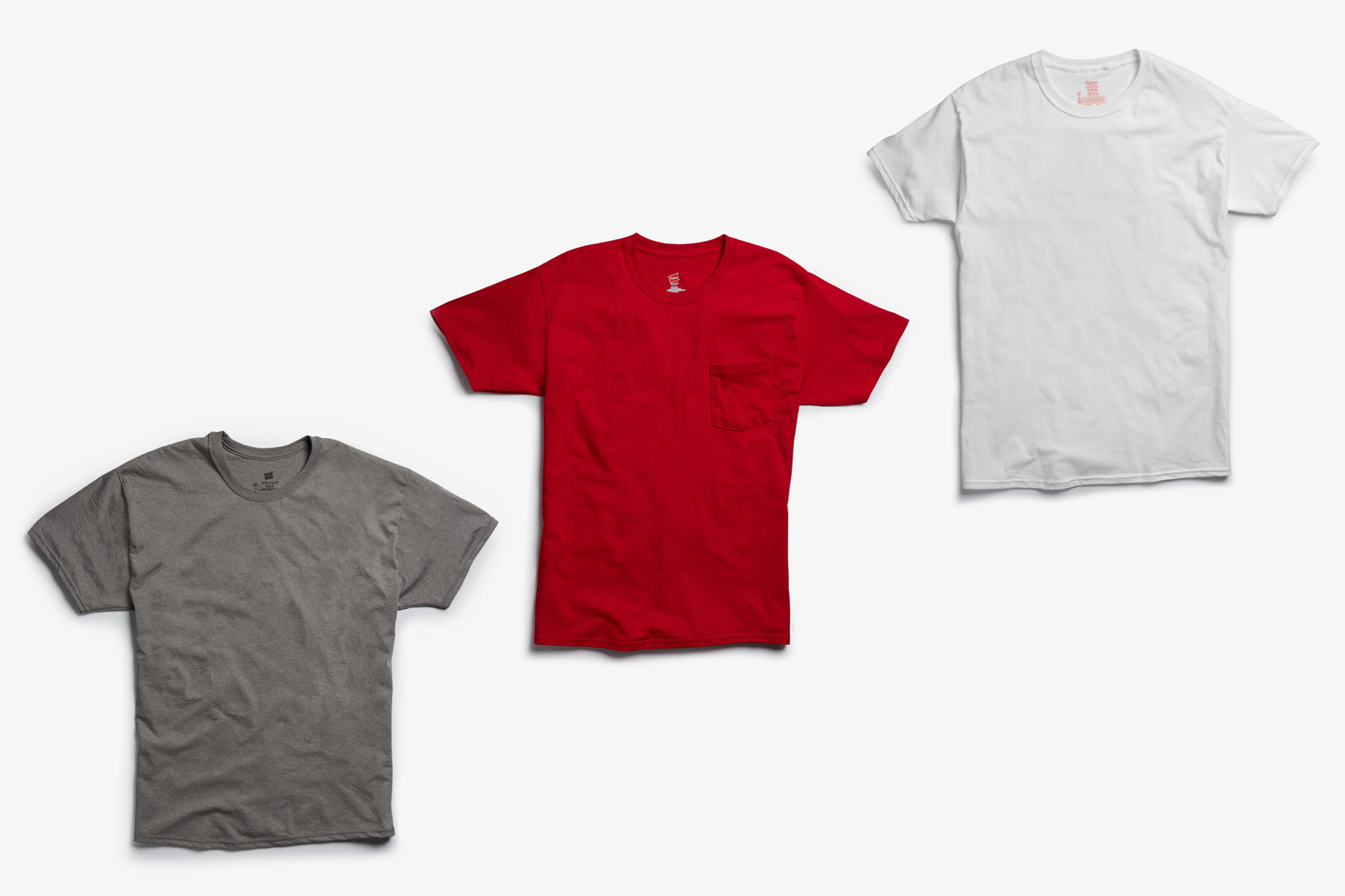
We arranged a quick shoot to capture consistent product shots. Compared to the generic imagery on hanes.com, we wanted to communicate a real, lived-in quality and focus on texture.
